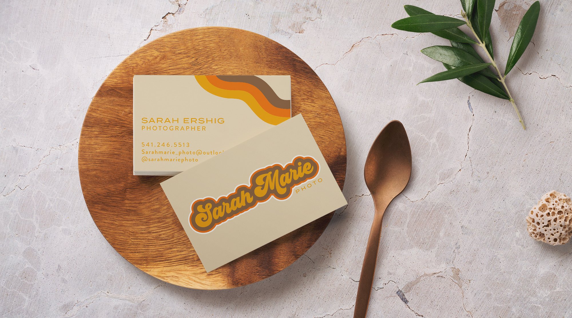
SARAH MARIE PHOTO
Initially, Sarah came to me looking for just a logo for her photography business that had started flourishing. Pinning down her exact vision proved to be slightly challenging, one that I was more than ready to take on. Together we were able to hone down her brand to invoke fun retro feels, along with also incorporating warmth and earthiness.

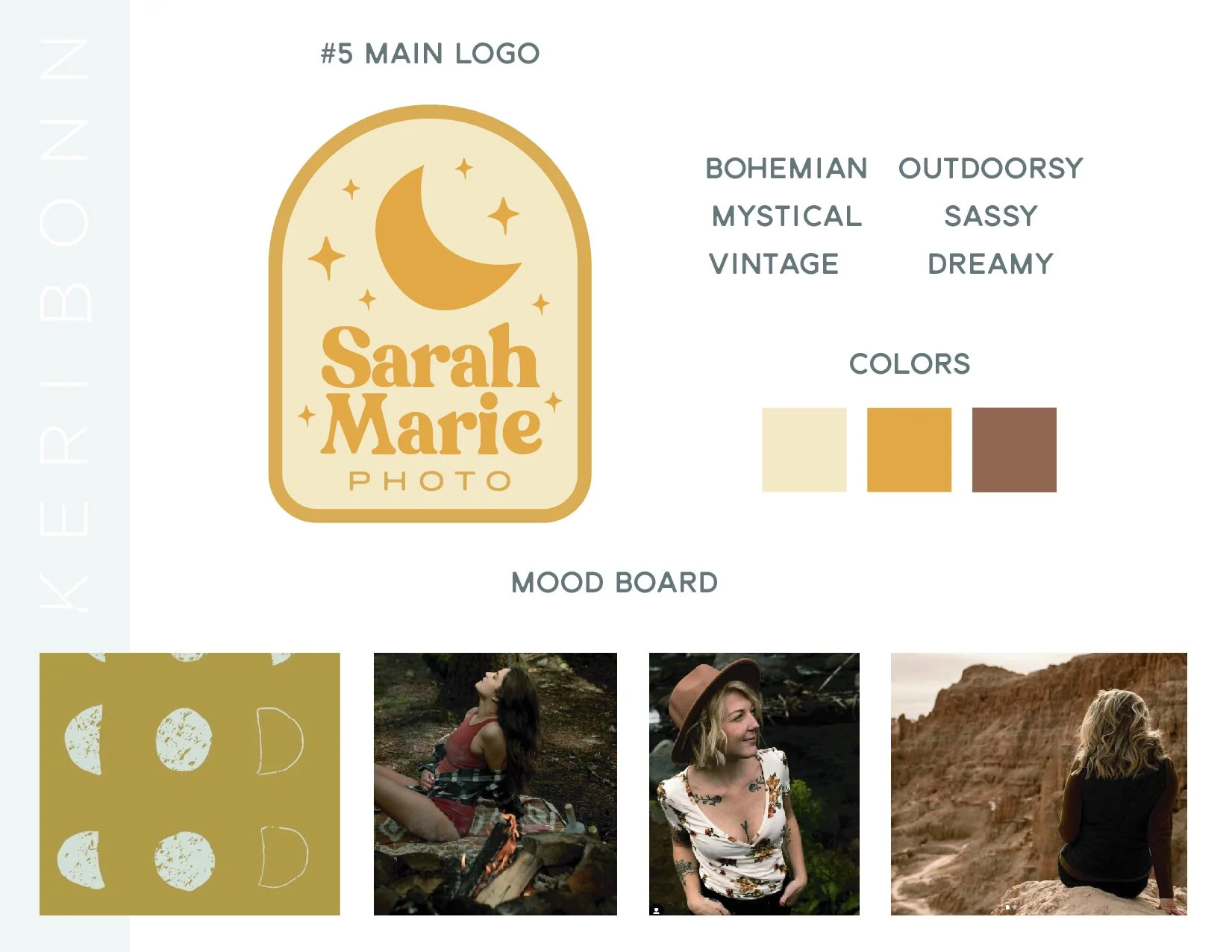
I started the process with a few mood boards to try and learn the aesthetic that she was going for. Working off of a Pinterest board Sarah had put together, I created seven different mood boards consisting of the logo that would go with this aesthetic, description words, color, and images from both the Pinterest board and from Sarah's own photography.
We eventually landing on going with number seven, the grooviest, most retro, and, as I stated in the mood board, "sooo 70s".

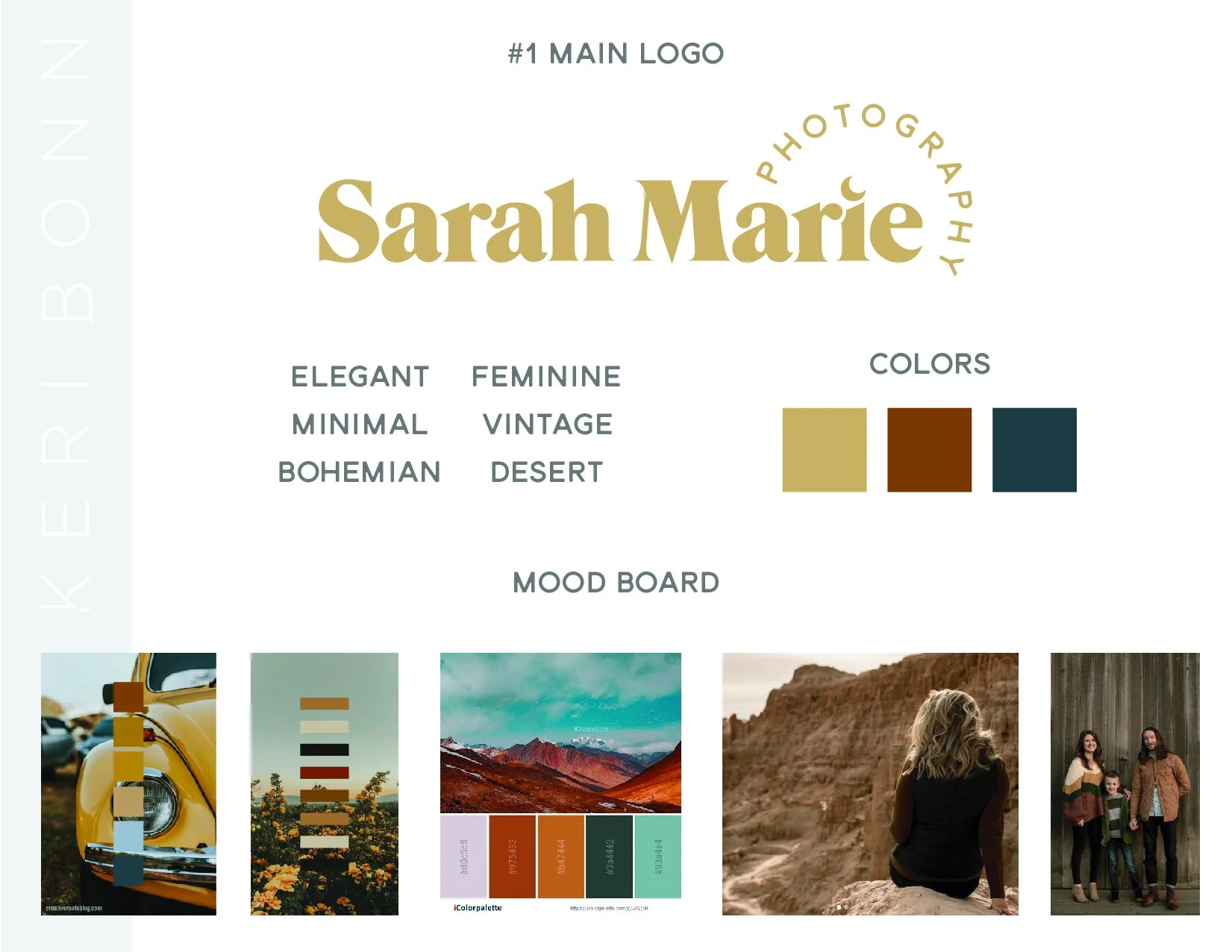
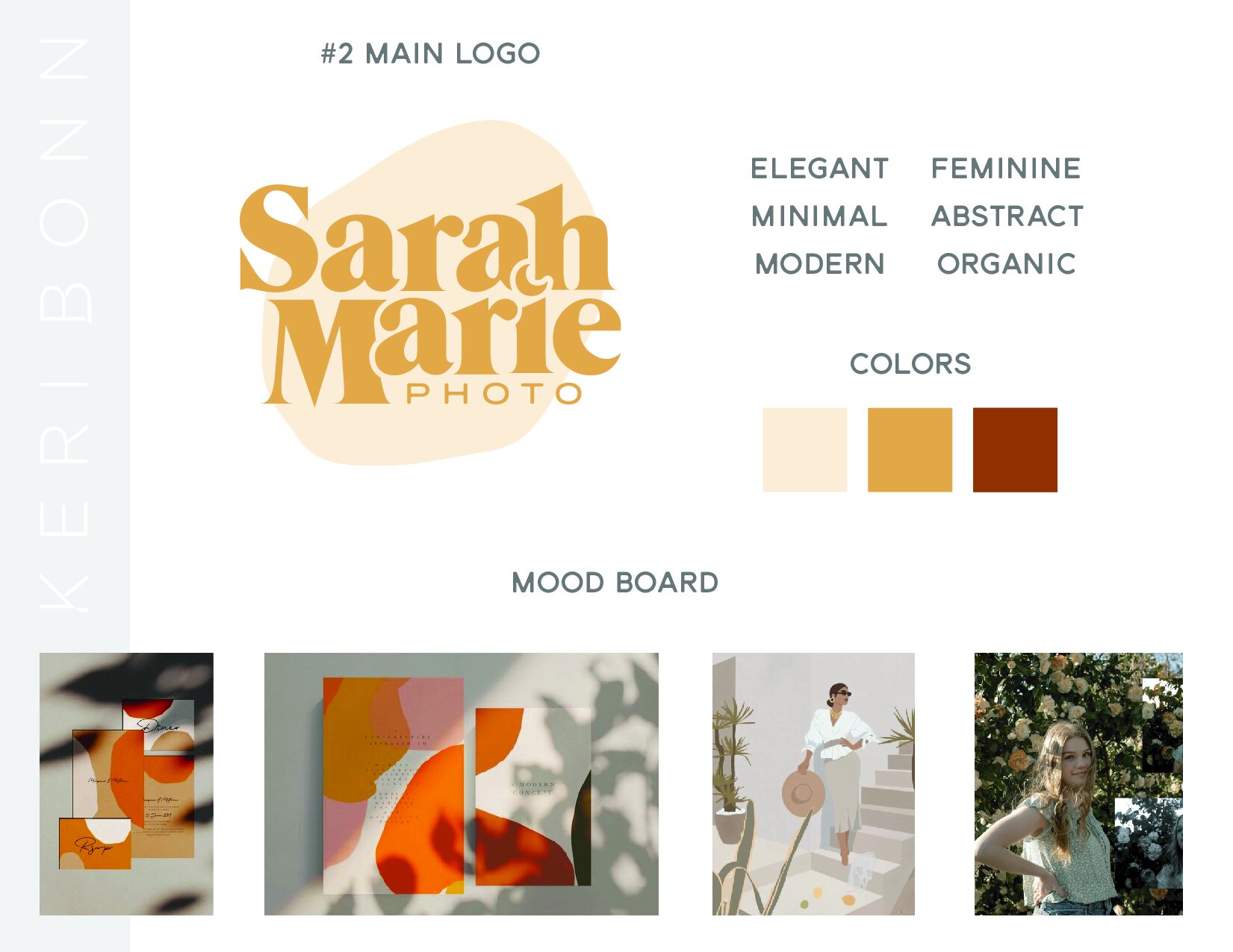
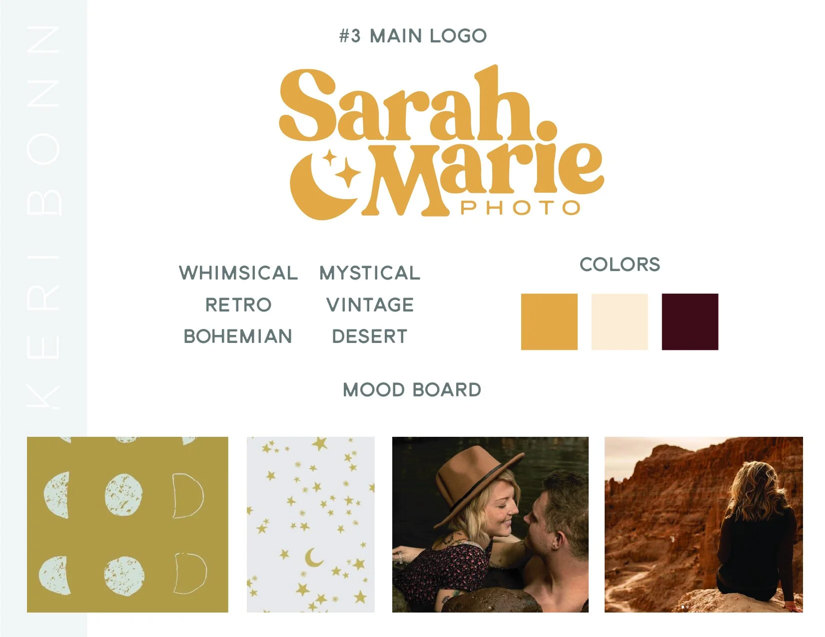

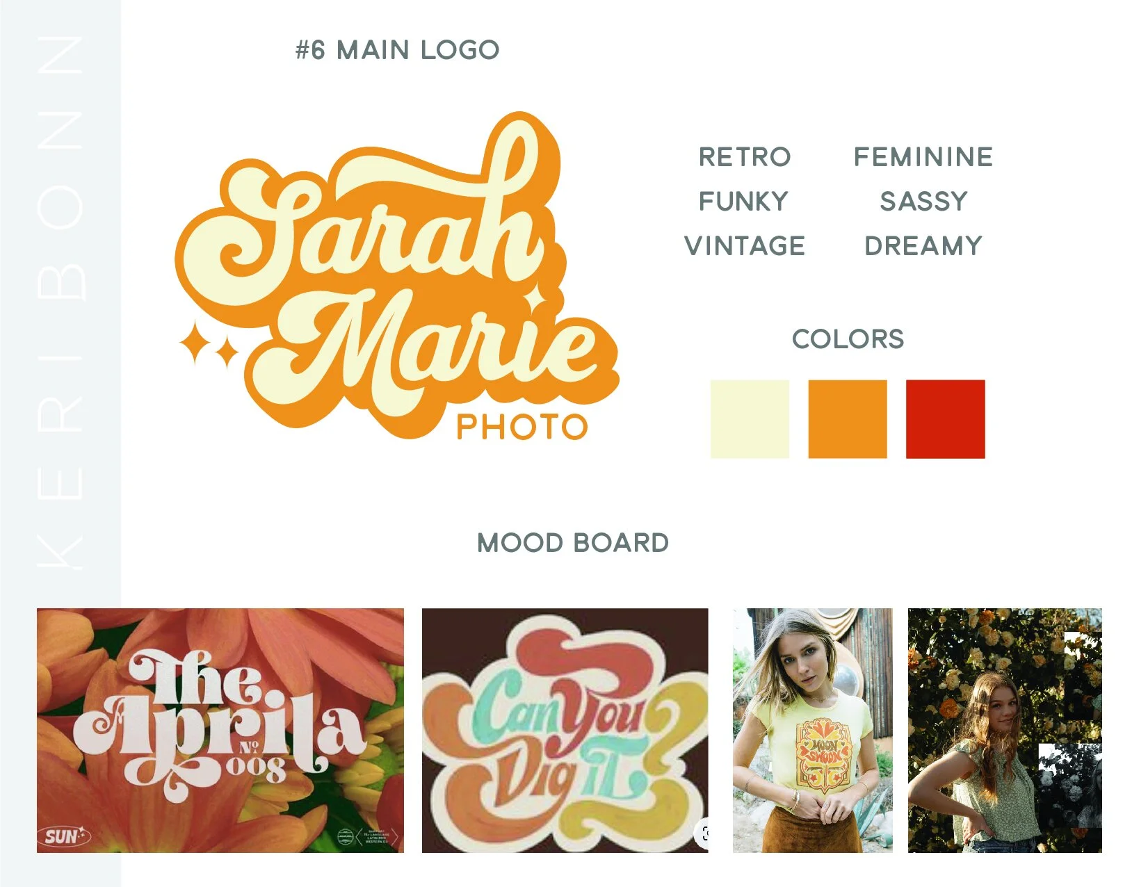
Despite the funk that shines in the seventh mood board, Sarah did want to keep some of that dreamy, warm, earthiness in her brand. Although this was a challenging couple of aesthetics to pair together, we found a delicate balance that really lets Sarah's bright, lovely soul shine through.
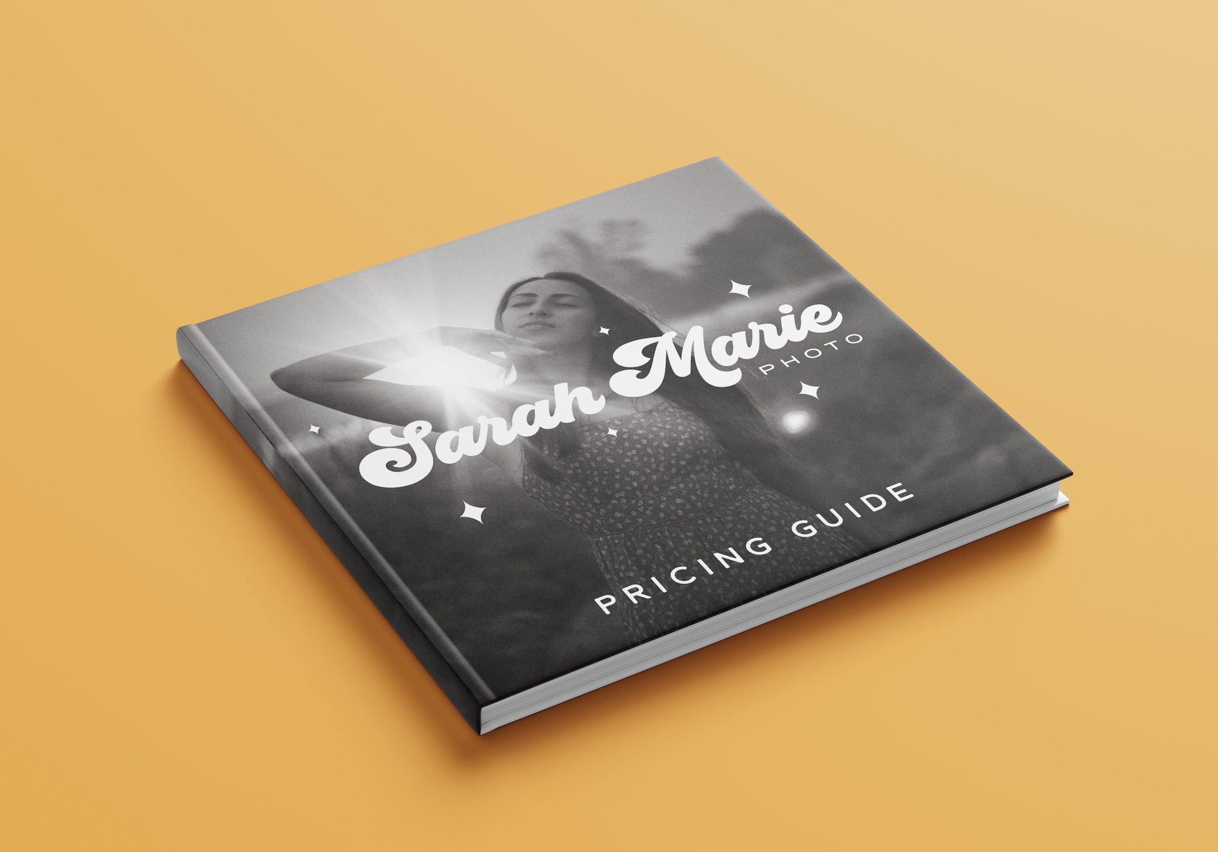
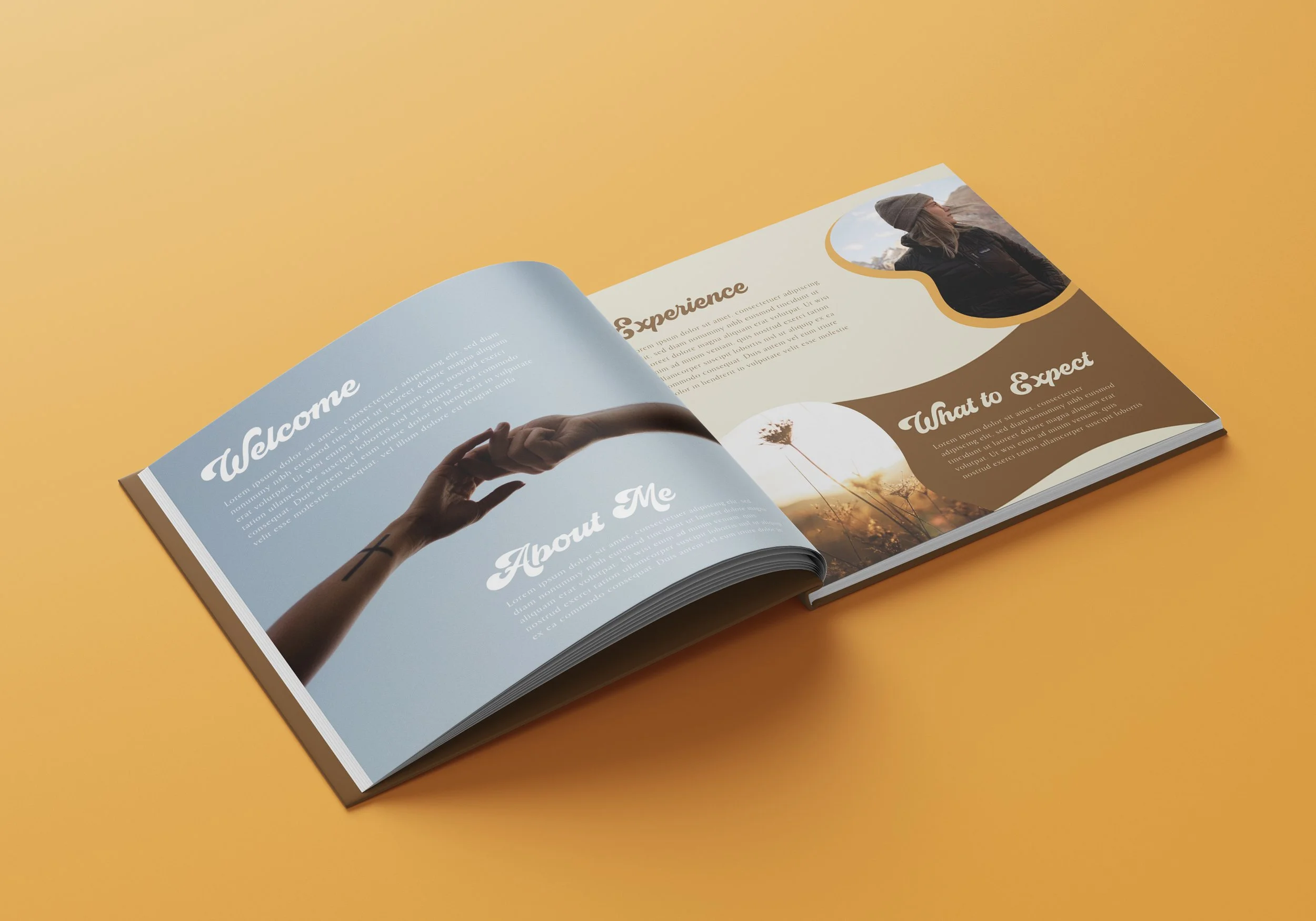
The most recent project has been the creation of Sarah's price guideline packet, designed to be sent to those with serious inquiring minds.