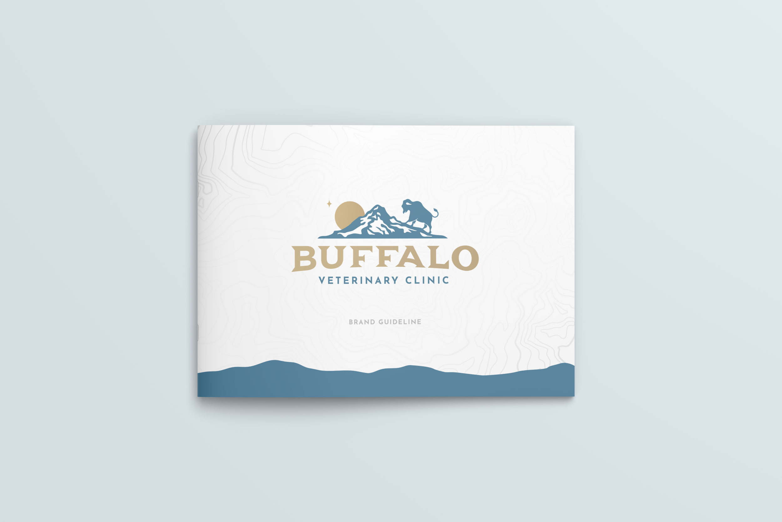
BUFFALO VETERINARY CLINIC
Buffalo Veterinary Clinic came to us at iVET360 in need of a complete brand overhaul. The owners had just recently bought the company, and were basically starting from scratch. The practice was located in a very small town, so they wanted to keep that small-town feel along with an elevated sense of design to mirror the new and improved level of pet care.

LET’S START AT THE VERY BEGINNING
The obvious starting point being: the logo.
The practice is located in the very small town of Buffalo, Wyoming. They wanted to keep that small-town feel while also adding an elevated sense of design to mirror the new and improved level of pet care. The clinic’s original logo had a buffalo and a mountain range, both being important elements that they wanted to keep.
-

The first option was an obvious one. The hump of a buffalo’s back creates such a perfect slope for a mountain range. I went with a simple, stylistic silhouette of the buffalo that can be easily scaled and identified. I had a vision of a font in my head that I just couldn’t find elsewhere, so I created the typeface myself.
-

The second option (which ended up being their final pick), shows the buffalo climbing the mountain, which was a play off of their old logo. I added a sun and sparkle to add balance to the composition, and used the wordmark from the first option with a slight distortion to create a new look.
-

A slight hail mary, I created this badge-style design to create a vintage logo that would help them stand out in the vet industry. It contains the same buffalo and mountain elements as the other two, with the addition of some small flourishes to keep it upscale. I chose a western-style slab serif font to really lift up the small-town feel.

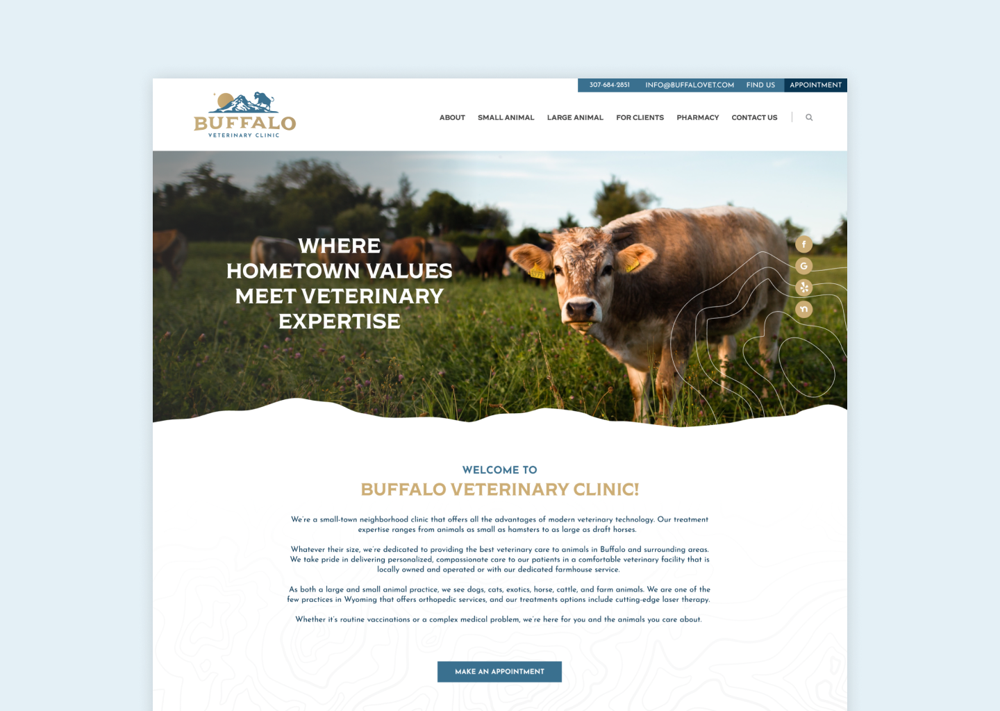
THE WORLD OF WEB
Now that we had a logo and a branding package, it was time to move to the big top: the website.
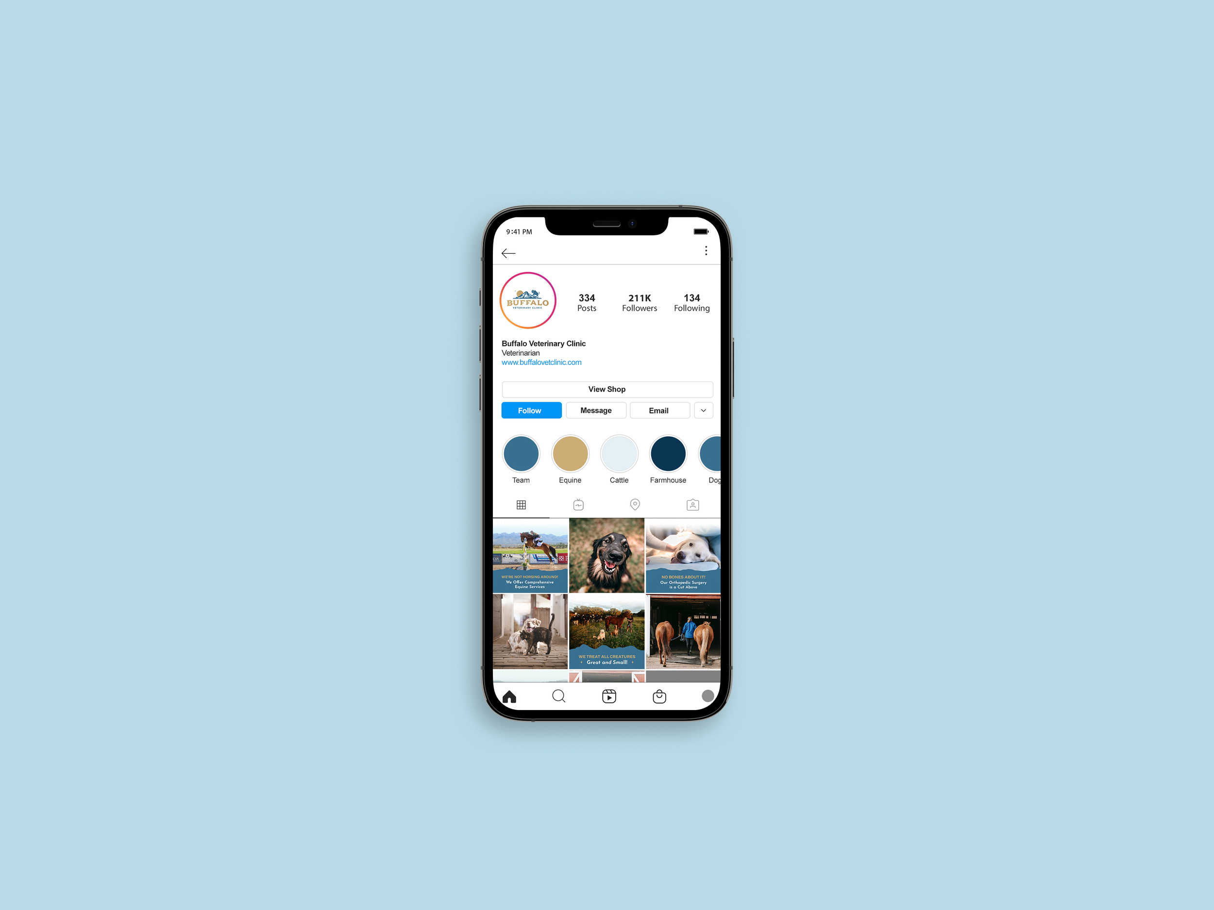
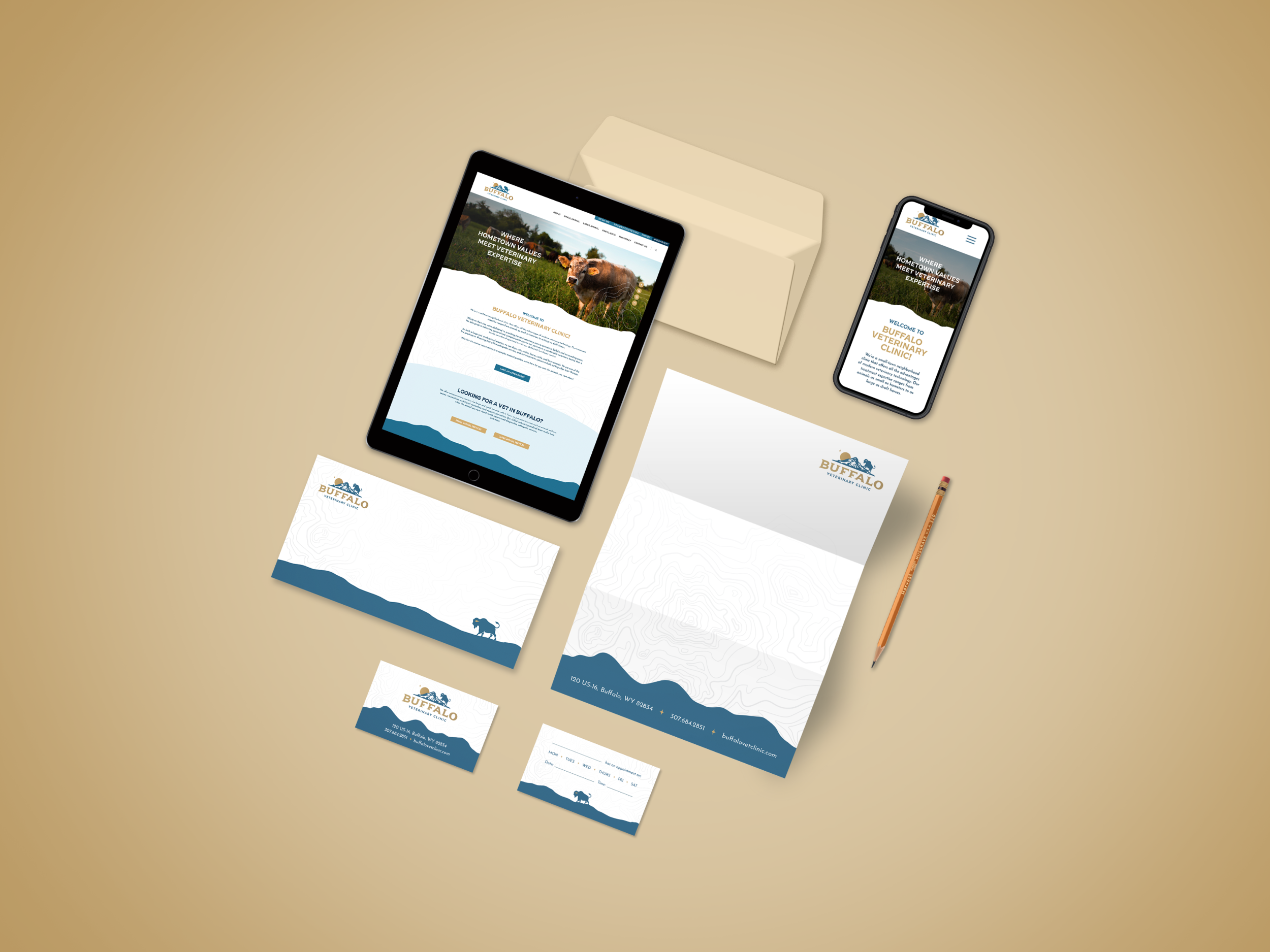
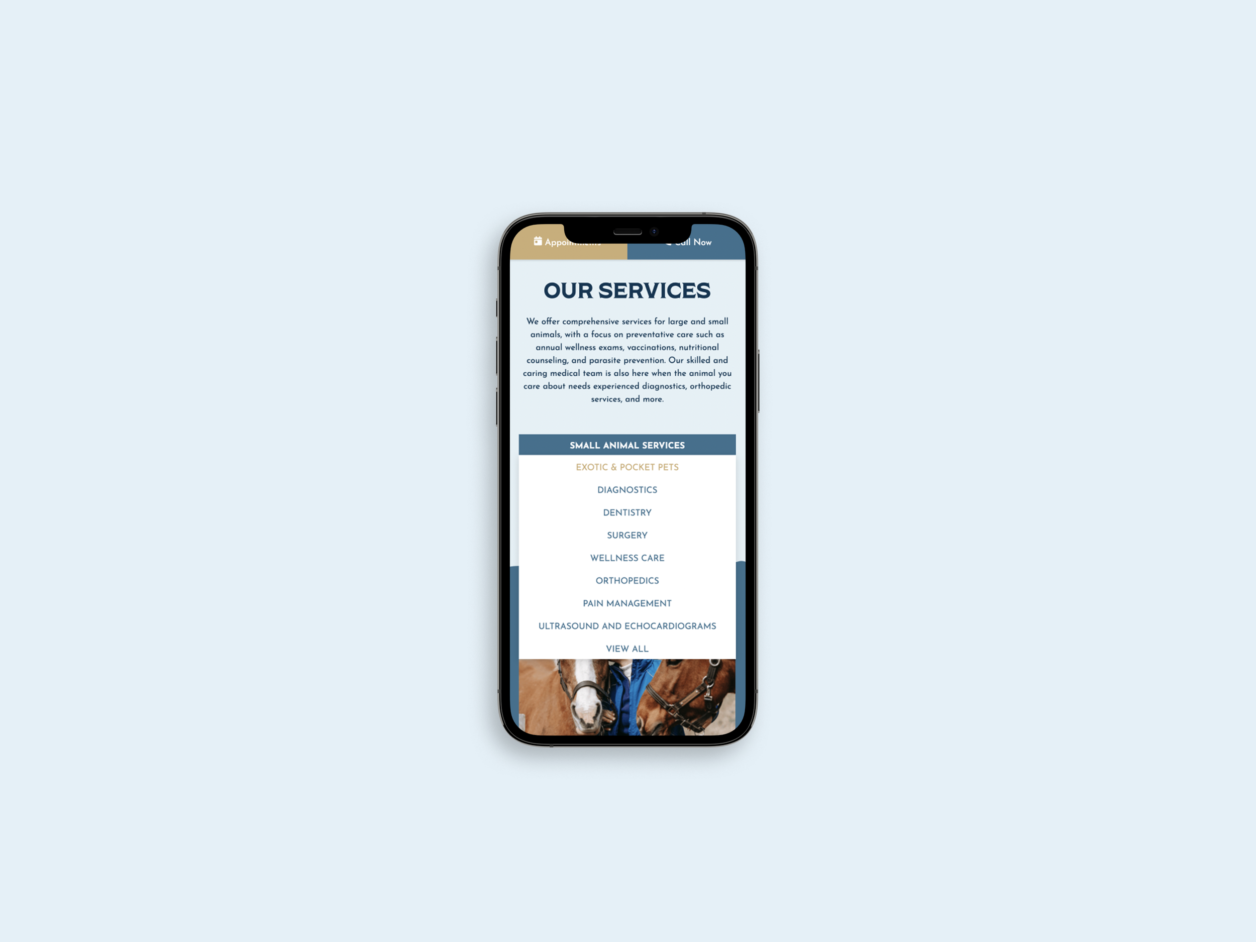
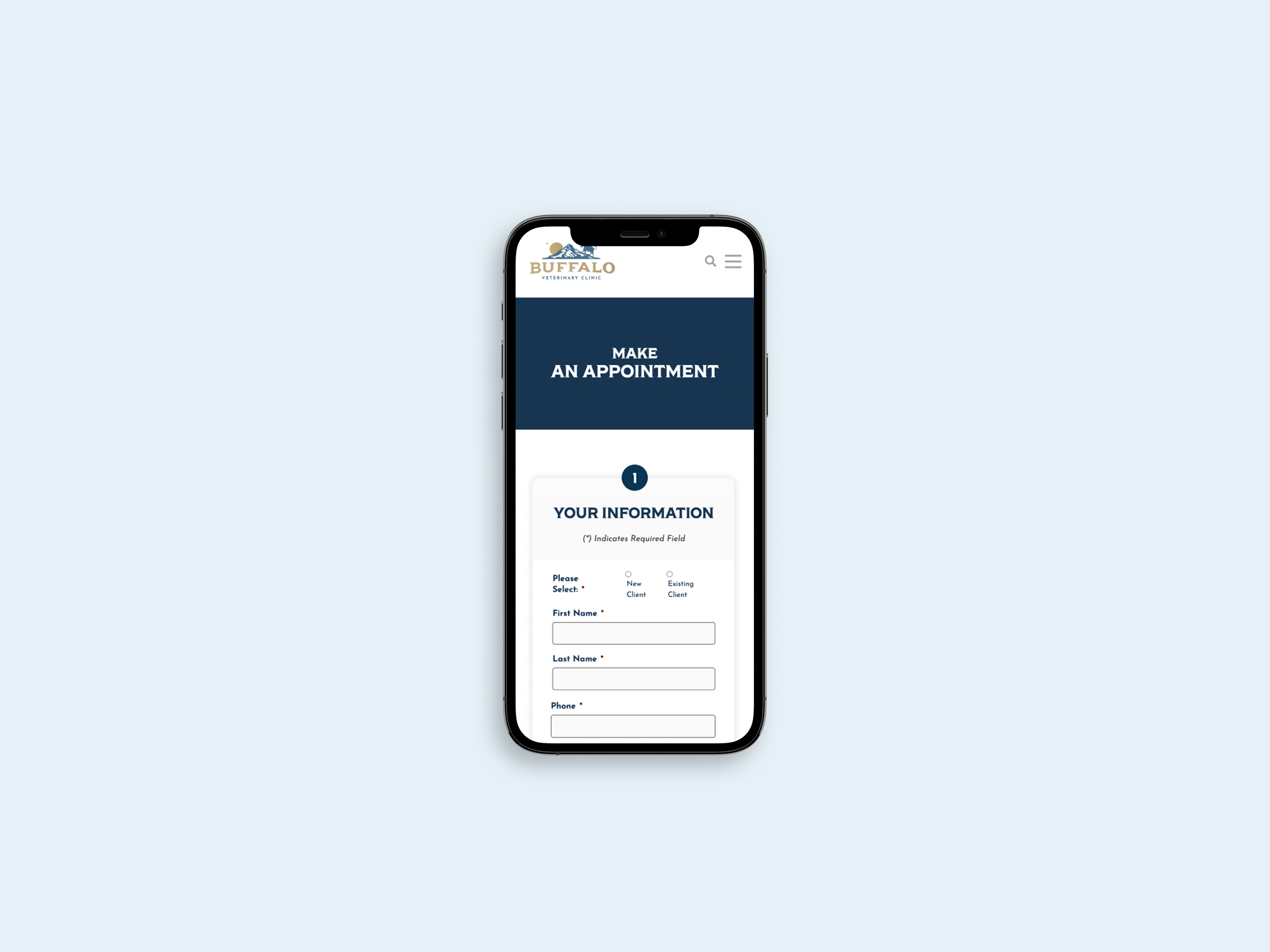
Buffalo really wanted to feature that unlike many other veterinary hospitals, they accept animal clients of all kinds - from the usual cats & dogs, to cattle, horses, and even alpaca - while still combining the hometown feel with a modern twist. I used the mix of imagery and topographic pattern to create an eye-catching design while still letting the important information be front and center. (and mobile-friendly, of course!)

LAST BUT NOT LEAST
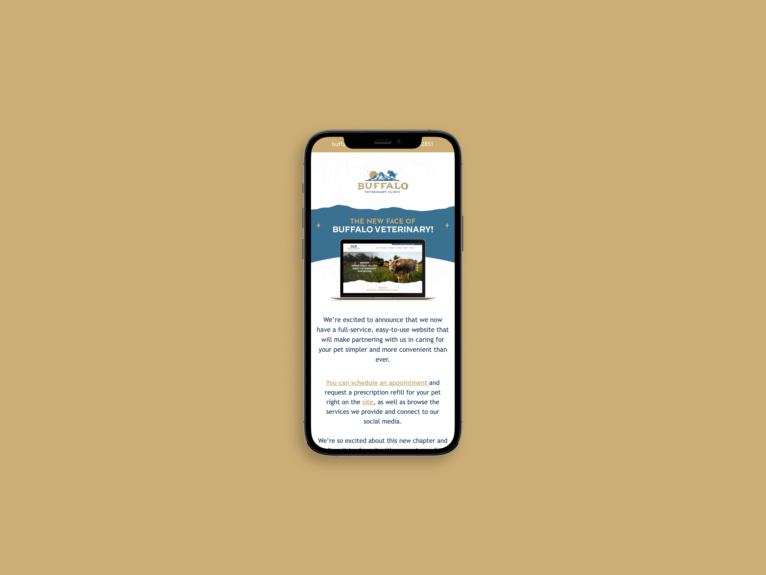
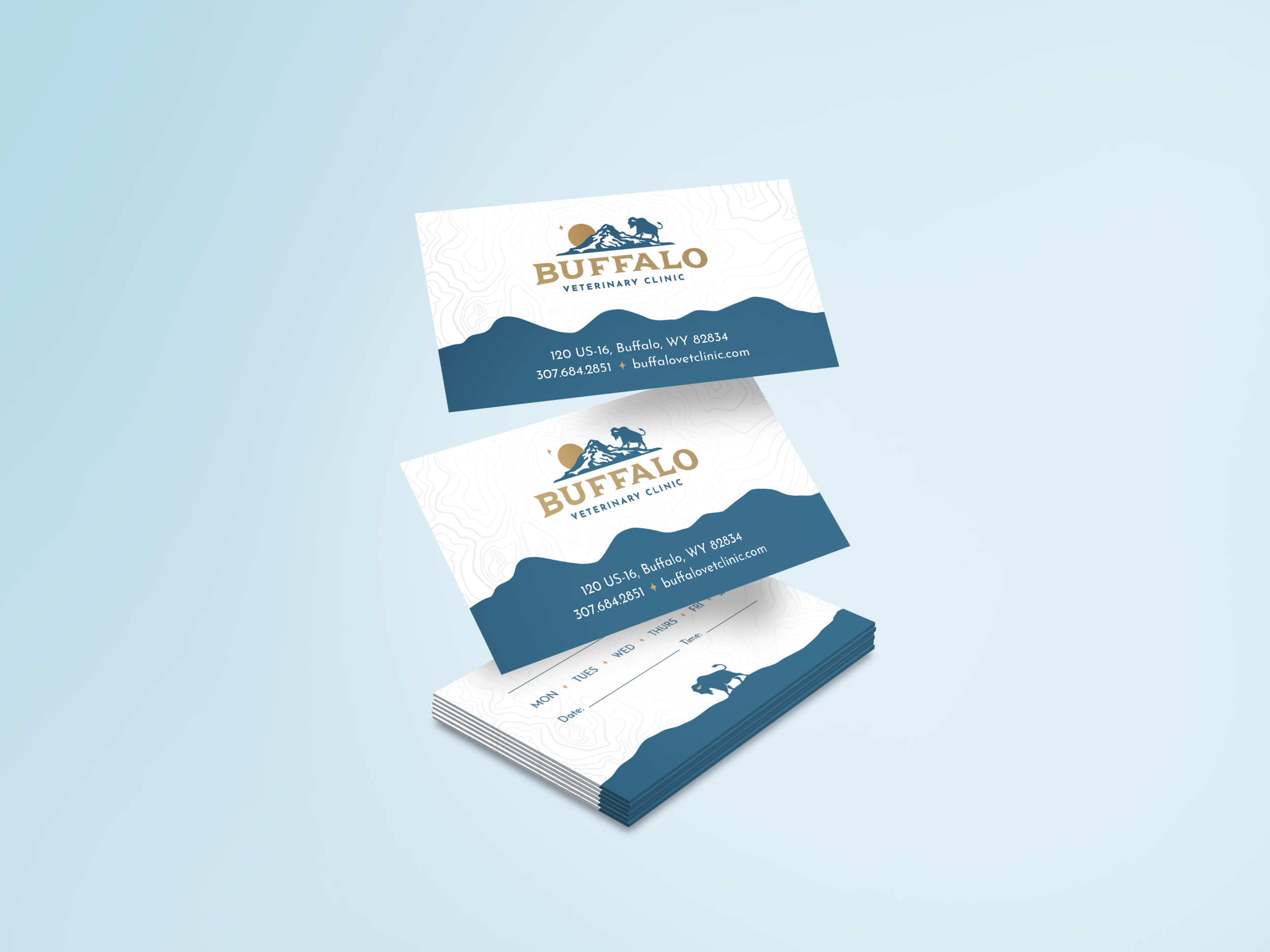
I then created all other collateral for the brand, both digital and print. Social media posts, letterhead, business cards, email marketing templates, envelopes - the whole shebang.
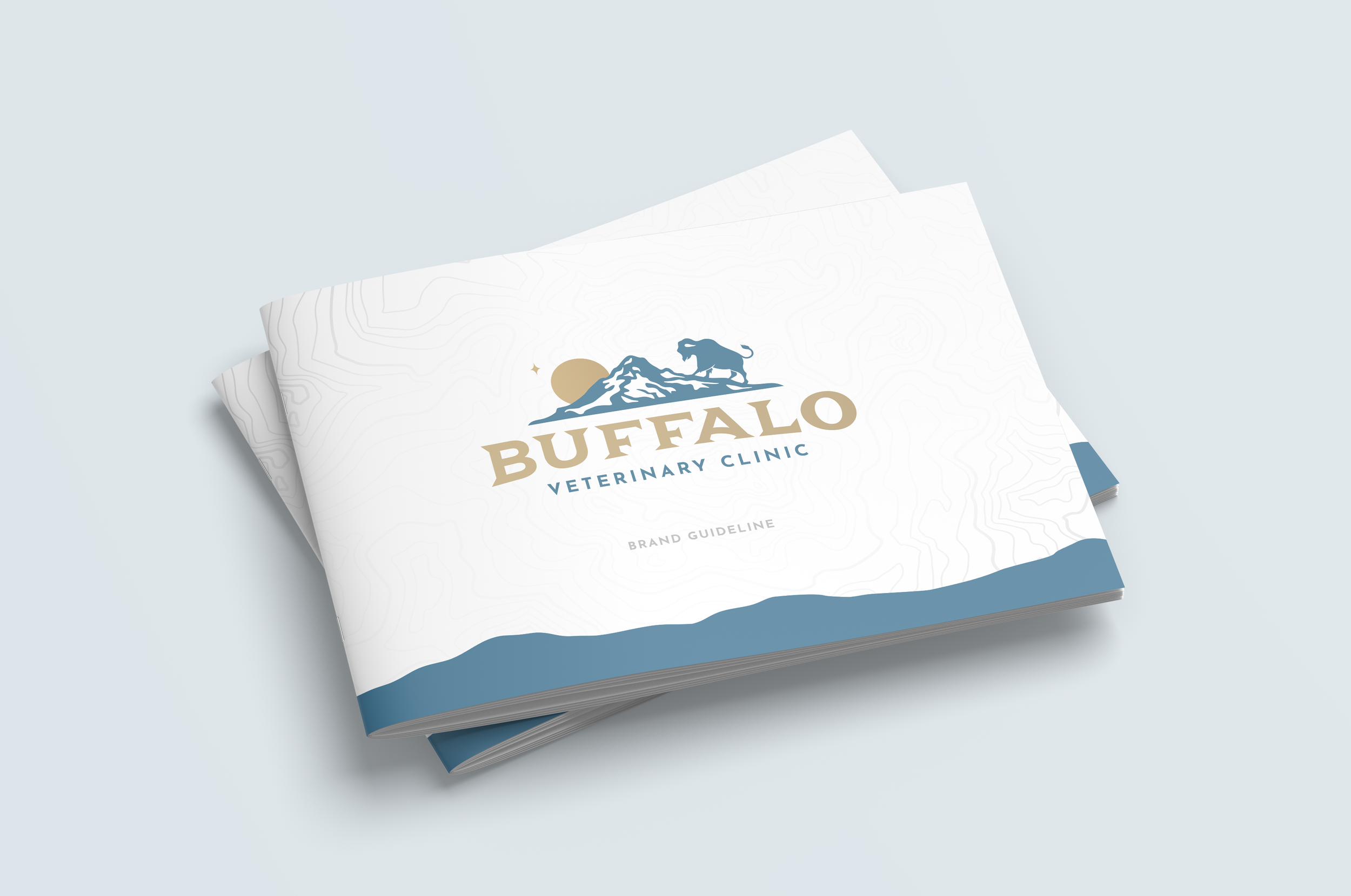
It can be hard to stand out in the veterinary world, but with the help of this new branding system, Buffalo Veterinary Clinic can remain a locally owned shining star of a practice.